Responsive Landing Page For Modern Zone Website
The Project Modern Zone is an online phone shop dedicated to people all over the world. Modern Zone strives to make shopping much funnier, specialty-knowing product features engagingly. They offer a wide spectrum of competitive Features. They exhibit their products in a modern and attractive manner that engages customers and improves their experience. Project duration: […]
The Project
Modern Zone is an online phone shop dedicated to people all over the world. Modern Zone strives to make shopping much funnier, specialty-knowing product features engagingly. They offer a wide spectrum of competitive Features. They exhibit their products in a modern and attractive manner that engages customers and improves their experience.
-
Project duration:
May 2023 to June 2023 -
Project Type:
Responsive website.
Project Overview
-
The problem:
Users assert that product descriptions are long and boring; they get lost in the product description so that they don't know what features the product has -
The goal:
Have a better display of product features attractively so that users know what the product does and have pleasant and joyful experiences -
My role:
UX designer designing a landing page for Modern Zone shop from conception to delivery. -
Responsibilities:
Conducting interviews, paper and digital wireframing, low and high-fidelity prototyping, conducting usability studies, accounting for accessibility, and iterating on designs
Understanding the user
- User research
- Personas
- Problem statements
- User journey maps
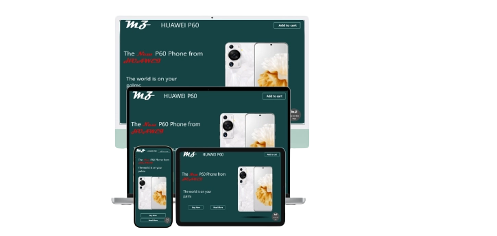
User research: summary
I conducted interviews and created empathy maps to get to know the users I was designing for and their needs. A prime user group identified through research was typical online shoppers who need help while shopping online.
This user group confirmed initial assumptions about the product landing page users, but research revealed that product description displaying issues were not the only factor limiting users from shopping online. Other user problems included time, accessibility, or challenges that make it difficult to shop online
User research: pain points
Time
Users waste much of their time understanding what features the product has
Accessibility
Some users cannot understand some of the terminologies that are used to describe the product features
Experience
Online shopping websites don’t provide engaging browsing experience
Navigation
Shopping website designs are often crumpled, which results in browsing confusion
Problem statement:
Eliot is a Cook who needs a better display of product features on e-commerce websites because He wants to know what the product does and have a pleasant and joyful experience
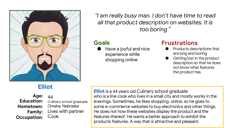
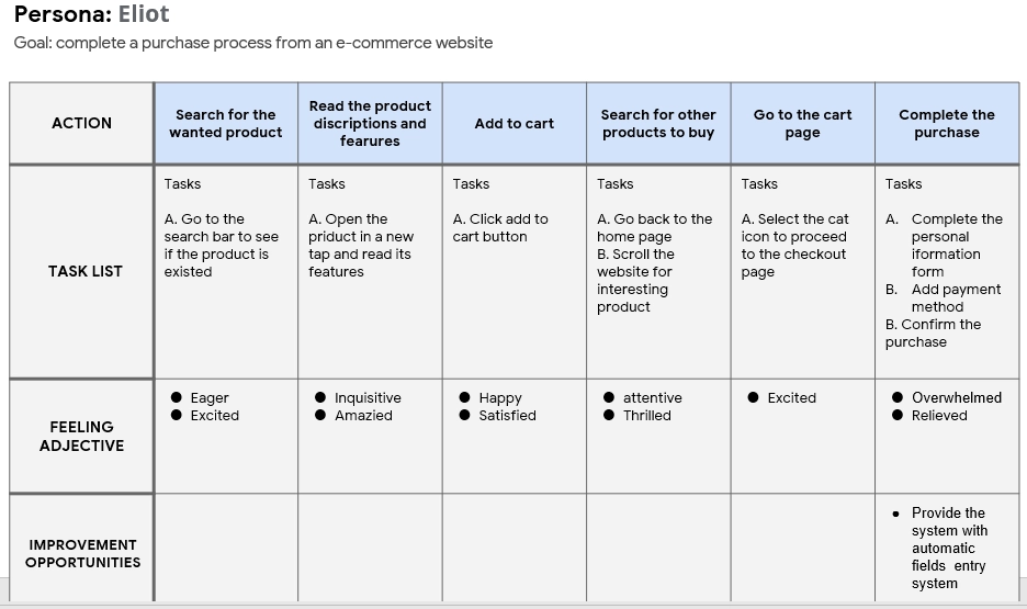
Mapping Eliot’s user journey revealed how helpful it would be for users to have access to a dedicated landing page.
Starting the design
- Sitemap
- Paper wireframes
- Digital wireframes
- Low-fidelity prototype
- Usability studies
Sitemap
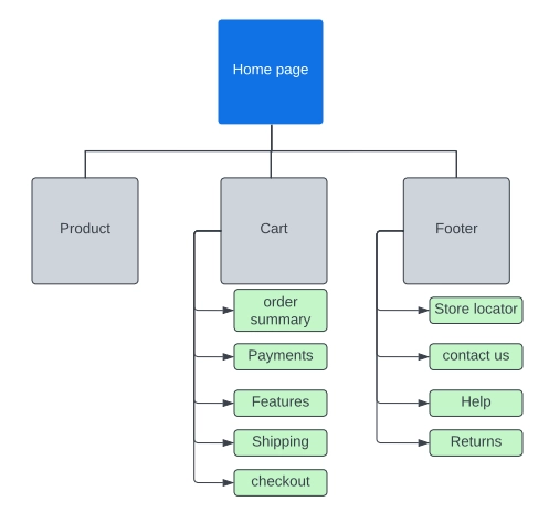
Difficulty with website navigation was a primary pain point for users, so I used that knowledge to create a sitemap.
My goal here is to make strategic information architecture decisions that would improve overall website navigation. The structure that I chose was designed to make things simple and easy
Paper wireframes
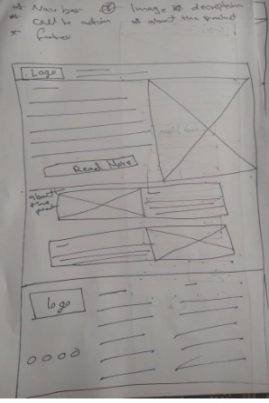
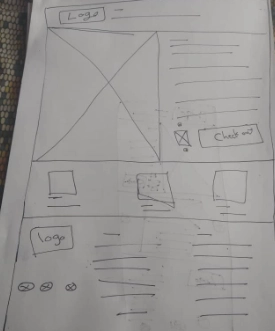
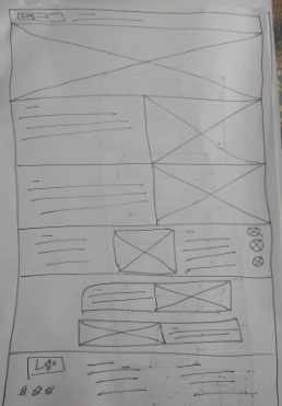
Taking the time to draft an iteration of each screen of the app on paper ensured that the elements that made it to digital wireframes would be well-suited to address user pain points. For the home page screen, I prioritized a quick and easy display for the product to help users save time
Paper wireframe screen size variations

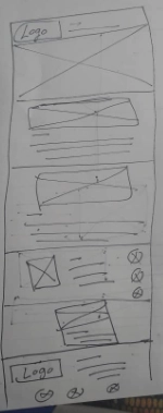
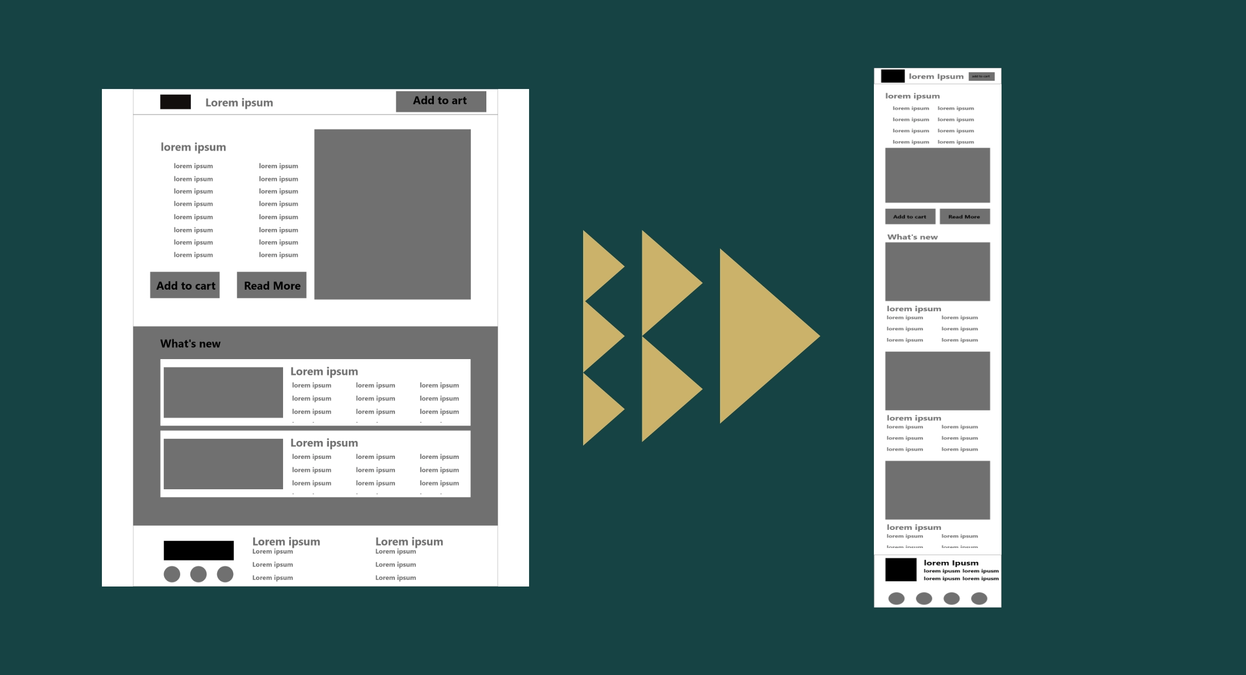
Because Modern Zone customers access the site on a variety of different devices, I started to work on designs for additional screen sizes to make sure the site would be fully responsive
Digital wireframes
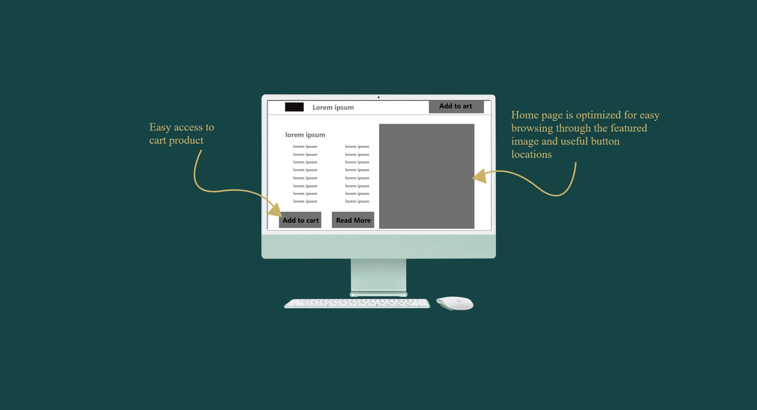
Moving from paper to digital wireframes made it easy to understand how the redesign could help address user pain points and improve the user experience.
Prioritizing useful button locations and visual elements placement on the home page was a key part of my strategy
Digital wireframe screen size variations
Low-fidelity prototype
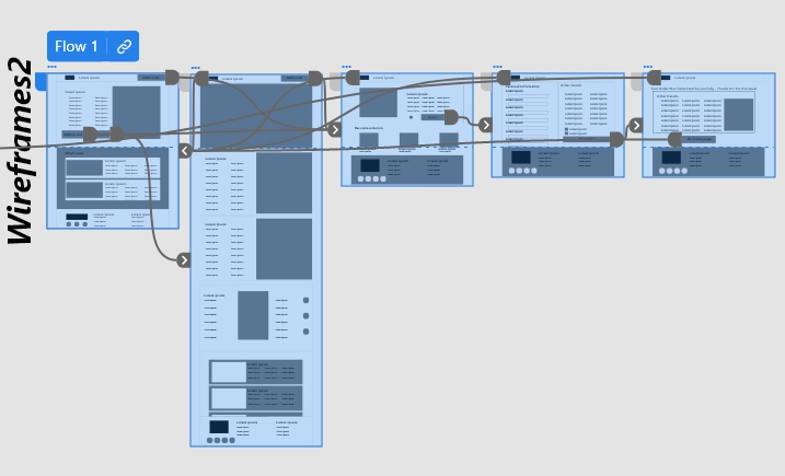
To create the low-fidelity prototype, I connected all the screens involved in the prime user flow of adding an item to the cart and checking out.
At this point, I had received feedback on my designs from some users about things like the placement of buttons and home page organization. I made sure to listen to their feedback and implemented several suggestions in places that addressed user pain point
Usability study: parameters
Study type:
Unmoderated usability study
Location:
Yemen, remote
Participants:
5 participants
Length:
20-30 minutes
Usability study: findings
I conducted one round of usability studies. Findings from the the study helped guide the designs from wireframes to mockups.
Checkout
Users were frustrated that they could not directly check out from the home page.
Confirmation
Users did not receive a confirmation message after placing the order
Browsing
During browsing, users have to scroll all the way back to top or buttom
Refining the design
- Mockups
- High-fidelity prototype
- Accessibility
Mockups
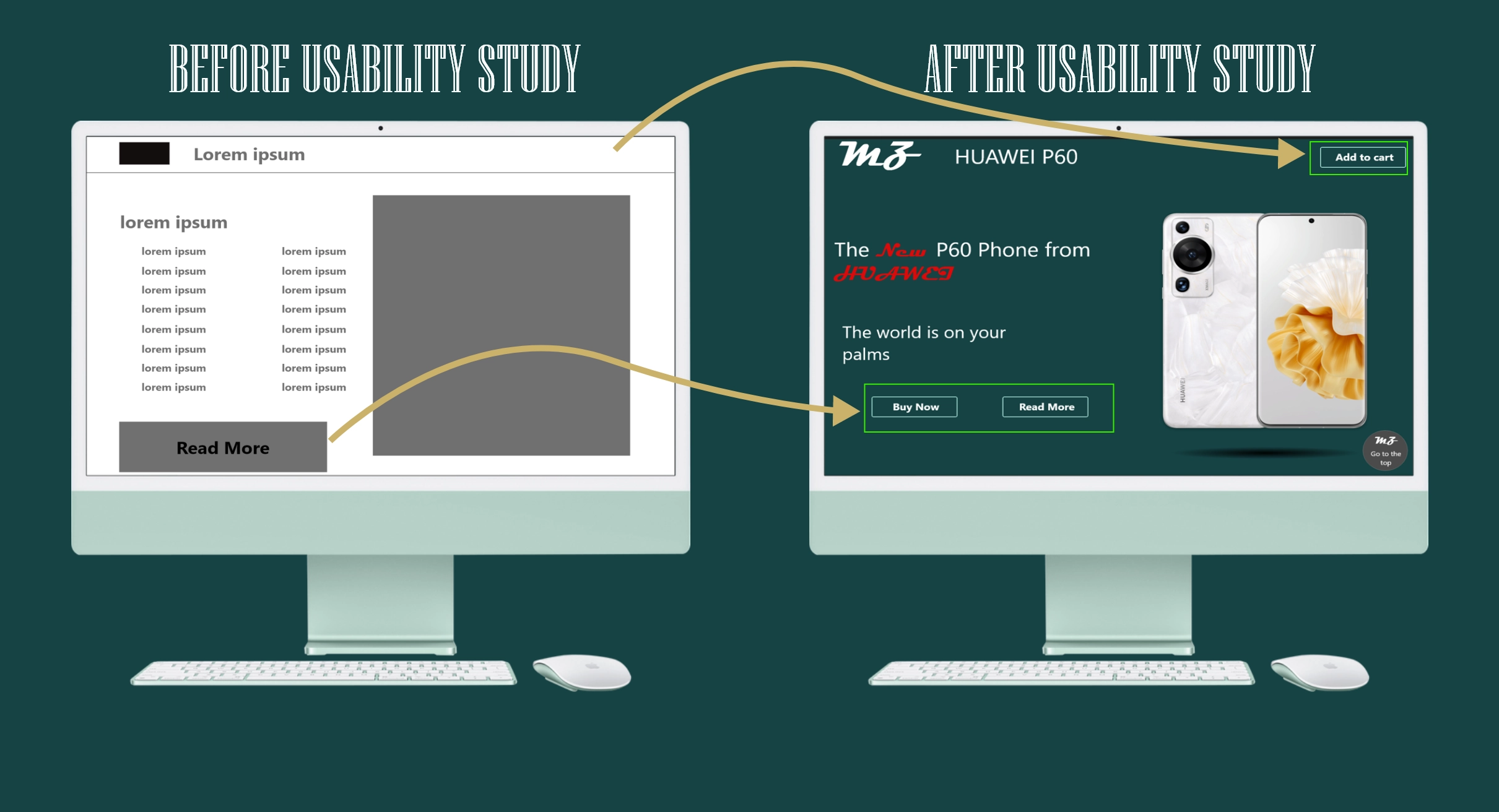
Based on the insights from the usability study, I made changes to improve the site's checkout flow. One of the changes I made was adding the option to directly add the product to the cart from the home page. This allowed users more freedom to add to their cart without going through complicated process
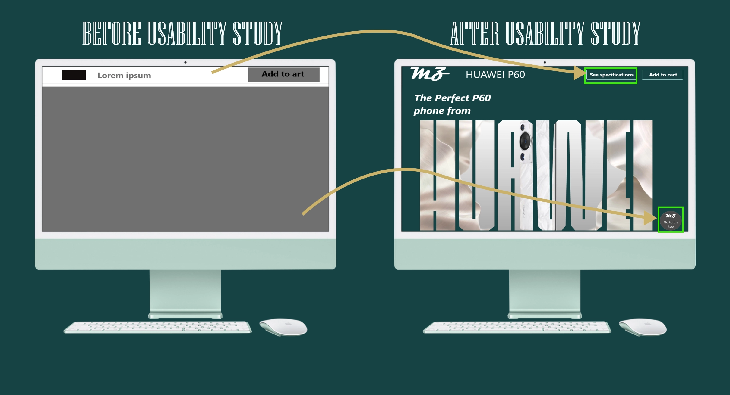
To make browsing even easier for users, I added a button that allowed users to go directly to the top or bottom of the page, and another one to take the users directly to the product features
Mockups: Original screen size
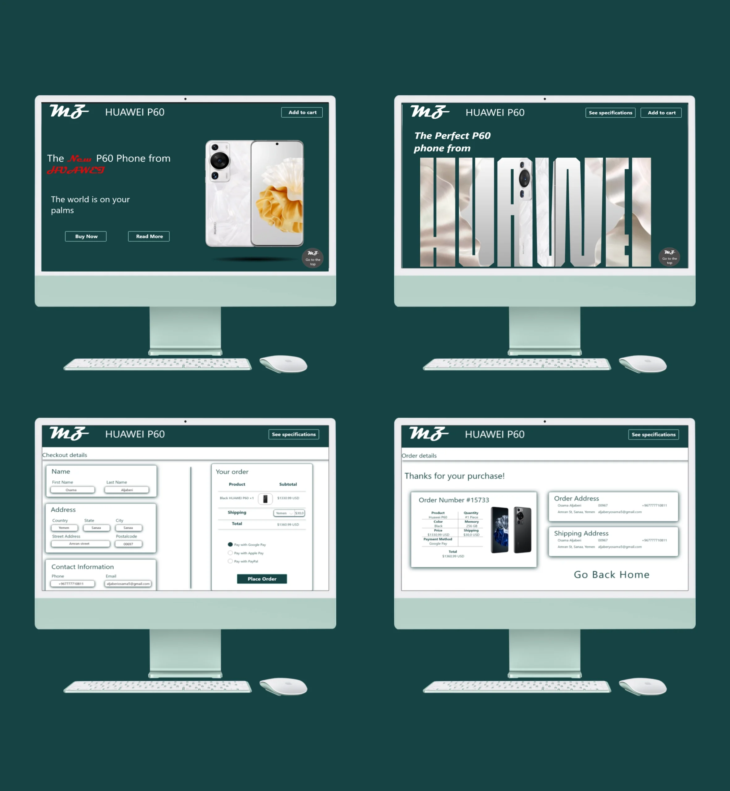
Mockups: Screen size variations
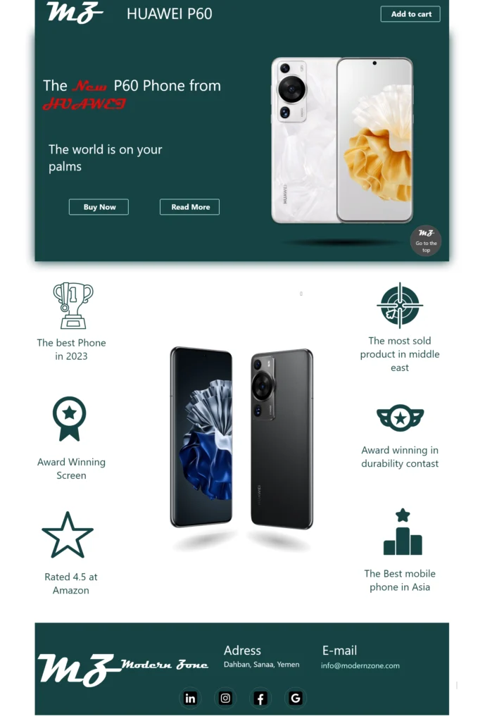

I included considerations for additional screen sizes in my mockups based on my earlier wireframes. Users shop from a variety of device sizes, such as mobile and tablet so that users have the smoothest experience possible.
High-fidelity prototype
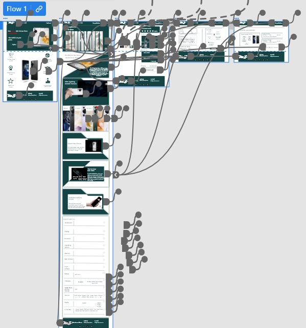
My hi-fi prototype followed the same user flow as the lo-fi prototype and included the design change made after the usability study
Accessibility considerations
Used heading with different sized text for clear visual hierarchy
Made many design variations for different screen sizes to make sure that users can access the website from any device
Provided access to users who are vision impaired by adding high-contrast colors. .
Going forward
- Takeaways
- Next steps
Takeaways
Impact:
The targeted users shared that the design was intuitive to navigate through, more engaging with images, and demonstrated a clear visual hierarchy.
What I learned:
I learned that even a small design change can have a huge impact on the user experience. The most important takeaway for me is to always focus on the real needs of the user when coming up with design ideas and solutions
Next steps
Conduct another round of usability studies to validate whether the pain points users experienced have been effectively addressed.
Identify any additional areas of need and ideate on new features
