Scala Sales Managment App
The Project Scala is a sales management app for business organizing dedicated to business people worldwide. Scala strives to make selling much easier, specialty managing the inventory and orders. They offer a wide spectrum of competitive Features. Scala targets business people like entrepreneurs who lack the time or ability to manage their projects efficiently. Project […]
The Project
Scala is a sales management app for business organizing dedicated to business people worldwide. Scala strives to make selling much easier, specialty managing the inventory and orders. They offer a wide spectrum of competitive Features. Scala targets business people like entrepreneurs who lack the time or ability to manage their projects efficiently.
-
Project duration:
December 2022 to April 2023. -
Project Type:
Mobile App.
Project Overview
-
The problem:
Business people want an effective approach to managing their sales, especially the inventory and orders -
The goal:
Design a sales management app that allows users to run their businesses as smoothly as possible -
My role:
UX designer designing an app for sales management from conception to delivery. -
Responsibilities:
Conducting interviews, paper and digital wireframing, low and high-fidelity prototyping, conducting usability studies, accounting for accessibility, and iterating on designs
Understanding the user
- User research
- Personas
- Problem statements
- User journey maps
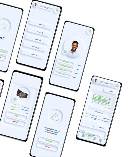
User research: summary
I conducted interviews and created empathy maps to get to know the users I was designing for and their needs. A prime user group identified through research was small business owners who need help managing their businesses.
This user group confirmed initial assumptions about the street-food sales management app users, but research revealed that management issues were not the only factor limiting users from managing their businesses. Other user problems included time, accessibility, or challenges that make it difficult to use sales management apps.
User research: pain points
Time
The time of business owners is priceless. They have to use every second effectively to run their business.
Accessibility
sales management platforms for are not equipped with assistive technology .
Management
Business owners need the help of technology to manage their businesses effectively by making data-oriented decisions
Problem statement:
Carlos is a small business owner who needs to Manage the inventory properly, business administration and marketing efforts because he wants his business to thrive and cope with challenges
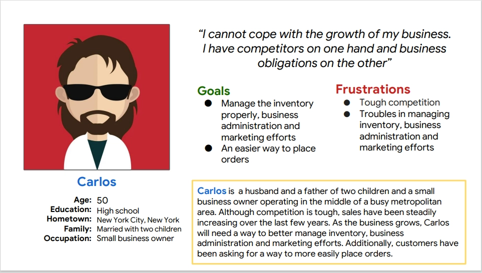
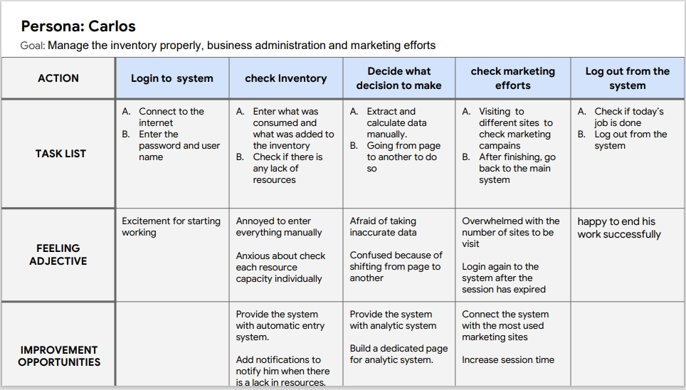
Mapping Carlos’s user journey revealed how helpful it would be for users to have access to a dedicated Sales management app.
Starting the design
- Paper wireframes
- Digital wireframes
- Low-fidelity prototype
- Usability studies
Paper wireframes
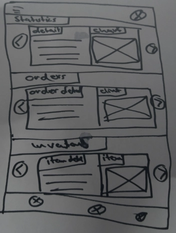
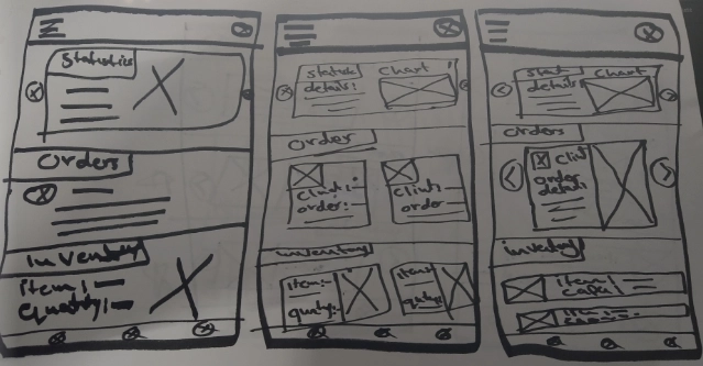
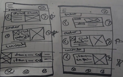
Taking the time to draft an iteration of each screen of the app on paper ensured that the elements that made it to digital wireframes would be well-suited to address user pain points. For the home page screen, I prioritized quick and easy access to inventory to help users save time.
Digital wireframes
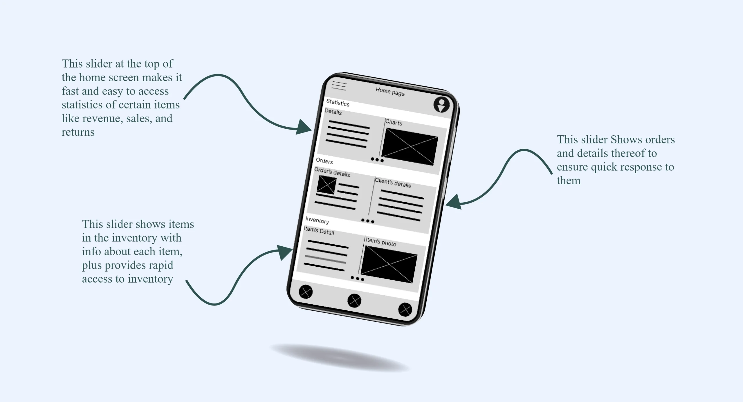
As the initial design phase containued, I made sure to base screen designs on feedbacks and findings from the user research
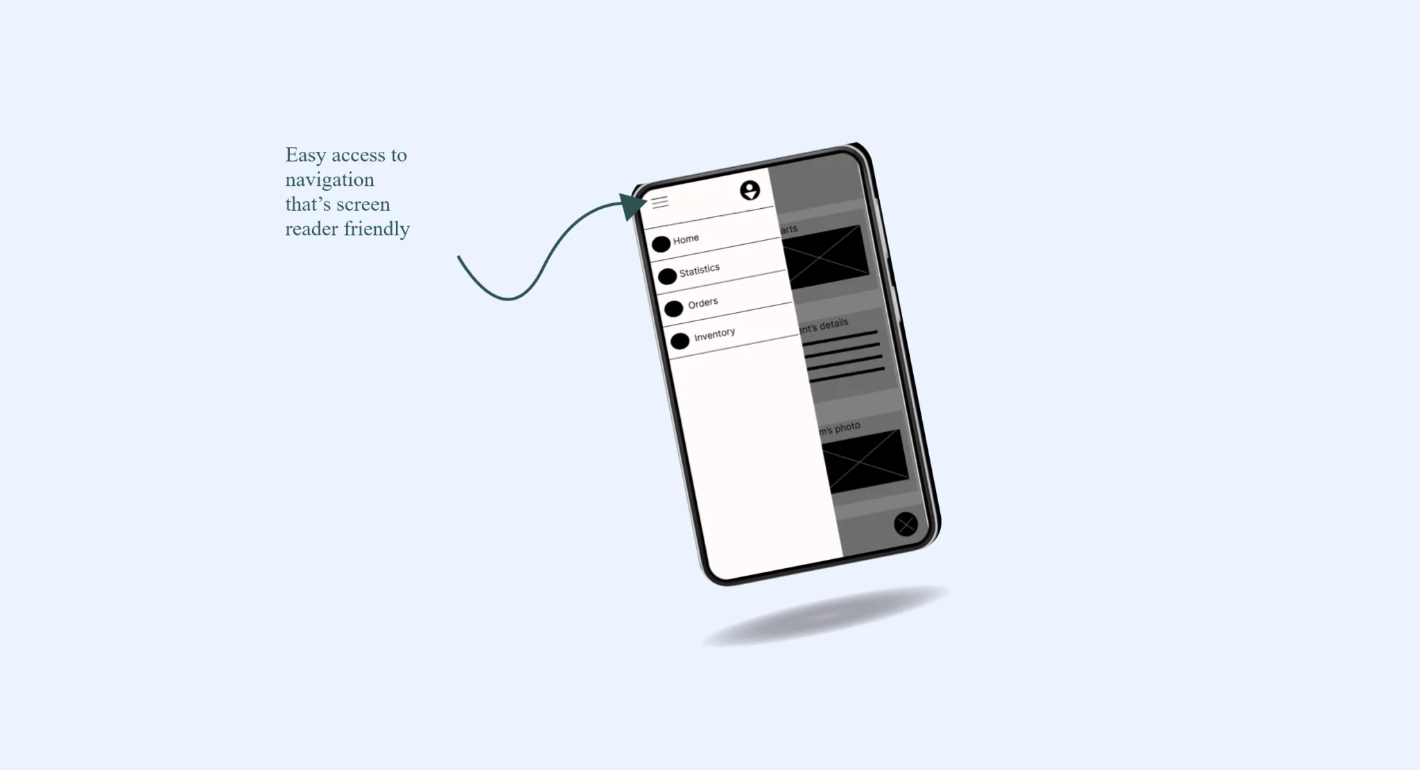
Friendly navigation was a key user need to address in the designs in additoin to equipping the app work with assistive technologies
Low-fidelity prototype
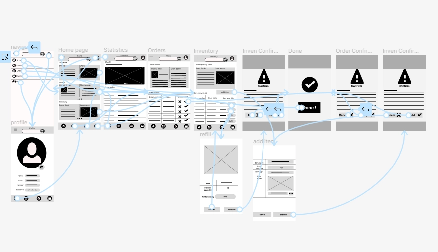
The low-fidelity prototype connected the primary user flow of managing sales, so the prototype could be used in a usability study with users
Usability study: findings
I conducted two rounds of usability studies. Findings from the first study helped guide the designs from wireframes to mockups. The second study used a high-fidelity prototype and revealed what aspects of the mockups needed refining.
Round 1 findings
- users want more control in the process of refilling the inventory
- users want more elaboration for the icon in the apps
Round 2 findings
- The navigation bar has many elements and thus it looks cramped
- Users want to confirm ordes directally from the home page
Refining the design
- Mockups
- High-fidelity prototype
- Accessibility
Mockups
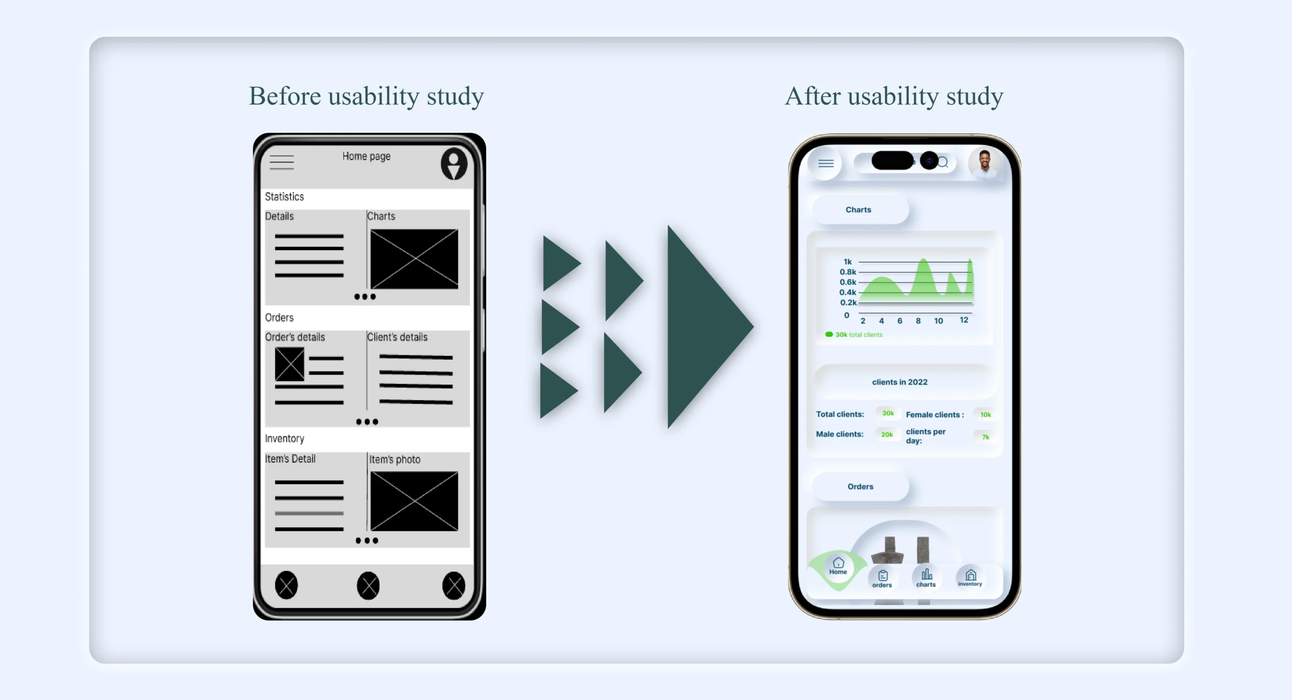
Early designs allowed for an effective navigation system, but after the usability studies, I added a search bar to make it much easier for users to navigate through the app. I also revised the design so users see all the important information when they first land on the screen.
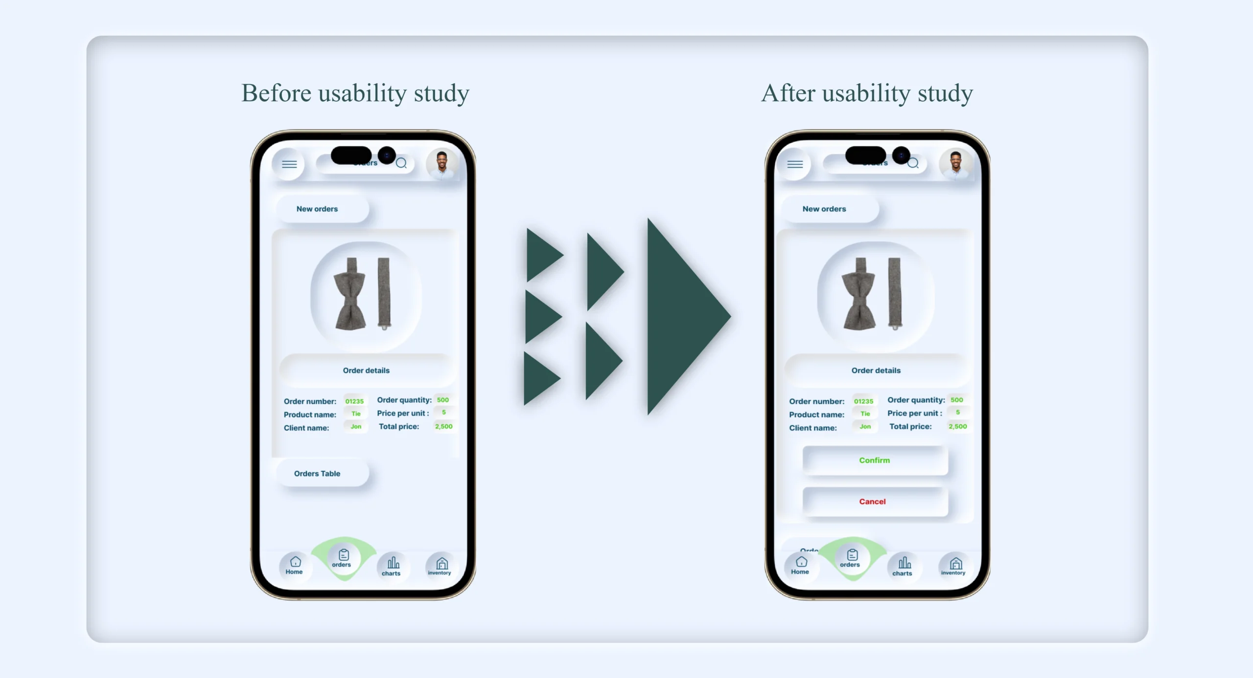
The second usability study revealed frustration with the order confirmation flow. To streamline this flow, I added Buttons under each order card that can directly confirm or cancel the order
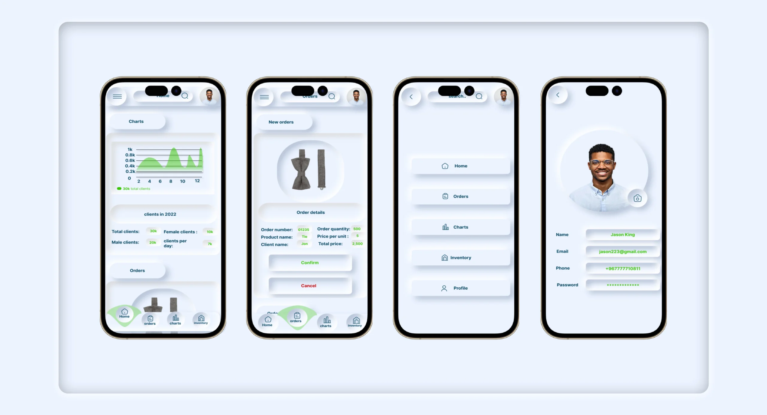
High-fidelity prototype
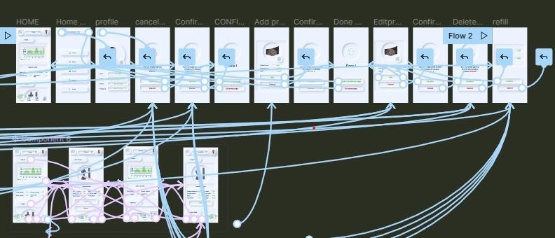
The final high-fidelity prototype presented cleaner user flows for managing inventory and orders. It also met user needs for fast order confirmation as well as easy navigation
Accessibility considerations
Used detailed charts for orders and inventory to improve all users' decision-making processes.
Used icons to help make navigation easier .
Provided access to users who are vision impaired by adding high-contrast colors. .
Going forward
- Takeaways
- Next steps
Takeaways
Impact:
The app makes users comfortable when
dealing with orders and inventory and helps
them achieve their business goals.
One quote from peer feedback:
“The app made it so easy and comfortable to
manage my own business! I would definitely use
this app as a go-to for efficient and effective
business management.”
What I learned:
While designing the sales management app, I learned that the first ideas for the app are only the beginning of the process. Usability studies and peer feedback influenced each iteration of the app’s designss. .
Next steps
Conduct another round of usability studies to validate whether the pain points users experienced have been effectively addressed.
Conduct more user research to determine any new areas of need”
Thank you for your time reviewing my work on the scala's sales management app! If you’d like to see more or get in touch, my contact information is provided below.
