Tooth Care App and Responsive Website
The Project Tooth care is focused on Teeth health and hygiene. Folks need an app that helps them take care of their teeth. Tooth care’s primary target users include people who are concerned with the health of their teeth and would like to learn more about how they can keep their teeth healthy Project duration: […]
The Project
Tooth care is focused on Teeth health and hygiene. Folks need an app that helps them take care of their teeth. Tooth care’s primary target users include people who are concerned with the health of their teeth and would like to learn more about how they can keep their teeth healthy
-
Project duration:
June 2023 to July 2023. -
Project Type:
Mobile App and Responsive Website.
Project Overview
-
The problem:
60% of people have teeth health issues due to the lack of teeth health care. The strategy team at Tooth Care has identified a lack of general knowledge about teeth care and a limited understanding of severe impact as crucial drivers for deteriorating teeth health. -
The goal:
Design an app that will improve education on the topic of teeth care and help people have better teeth health. -
My role:
UX designer designing an app for sales management from conception to delivery. -
Responsibilities:
Conducting interviews, paper and digital wireframing, low and high-fidelity prototyping, conducting usability studies, accounting for accessibility, and iterating on designs
Understanding the user
- User research
- Personas
- Problem statements
- User journey maps
User research: summary
I used Google’s data on teeth health to develop interview questions, which were then used to conduct user interviews. Most interview participants reported feeling bad about their teeth health, but they didn’t actively try to improve their own teeth health. The feedback received through research made it very clear that users would be open and willing to work towards eliminating teeth health issues if they had access to an easy-to-use tool to help guide them.
Problem statement:
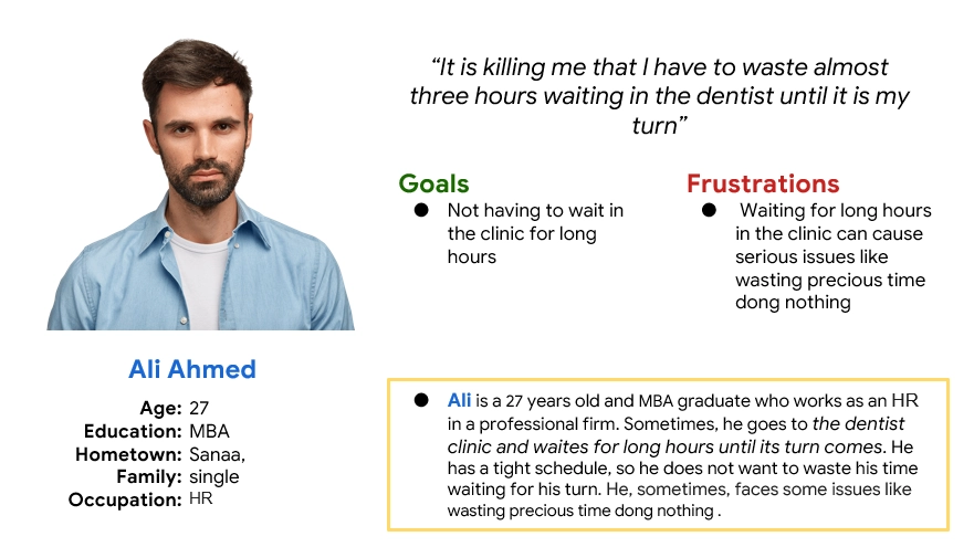
Ali is an HR who needs not having to wait in the clinic for long time because he does not want to waste precious time doing nothing
Problem statement:
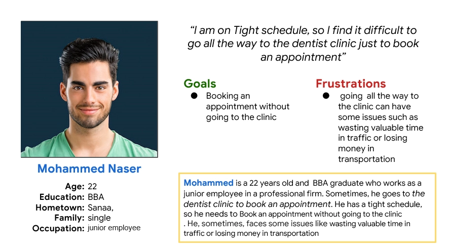
Mohammed is a junior employee who needs To book an appointment without going to the clinic because He does not want to waste valuable time in traffic or losing money in transportation.
Competitive audit


An audit of a few competitor’s products provided direction on gaps and opportunities to address with the Tooth Care app.
Ideation
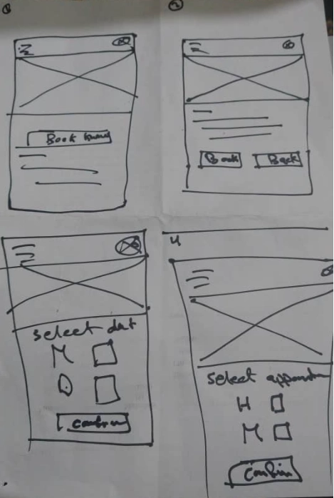
I did a quick ideation exercise to come up with ideas for how to address gaps identified in the competitive audit. My focus was specifically on the booking system and convenient and intuitive navigation.
Starting the design
- Digital wireframes
- Low-fidelity prototype
- Usability studies
Digital wireframes
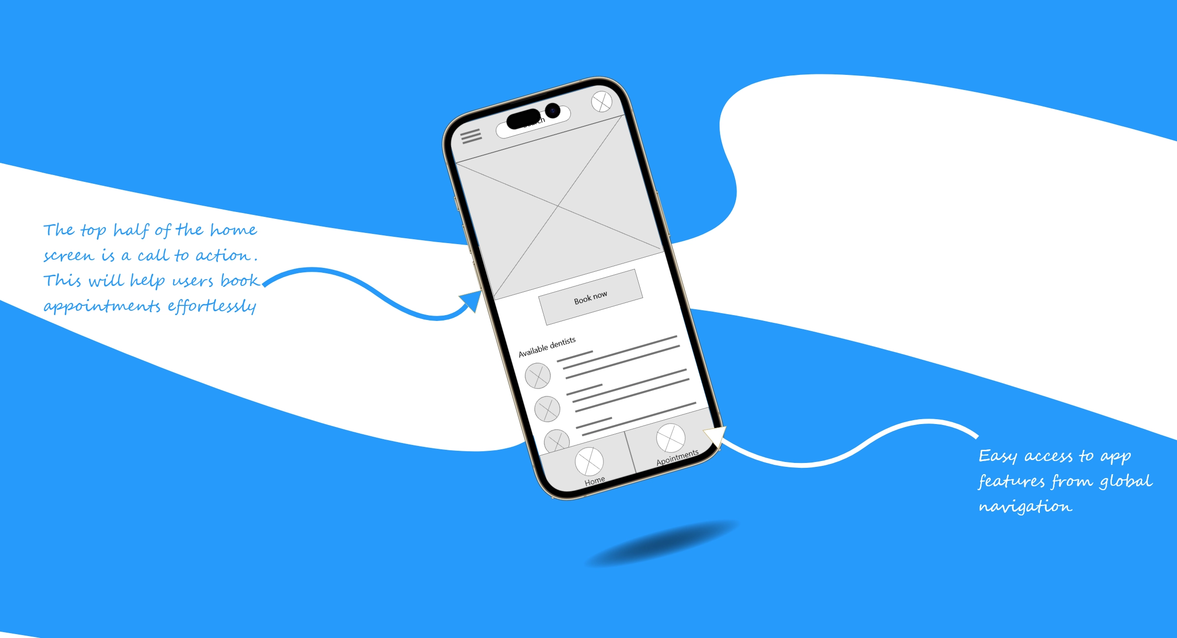
After ideating and drafting some paper wireframes, I created the initial designs for the Tooth Care app. These designs focused on delivering personalized guidance to users to help them to book appointments.
Low-fidelity prototype
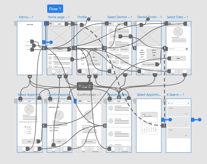
To prepare for usability testing, I created a low-fidelity prototype that connected the user flow of viewing dentists and booking appointments.
Usability study: parameters
Study type:
Unmoderated usability study
Location:
Yemen, remote
Participants:
5 participants
Length:
20-30 minutes
Usability study: findings
These were the main findings uncovered by the usability study:
Date selector
People want a date selector that is intuitive and smart.
Appointment Dates
People want to see only available dates
Browsing
People want icons that describe the section's purposes.
Refining the design
- Mockups
- High-fidelity prototype
- Accessibility
Mockups
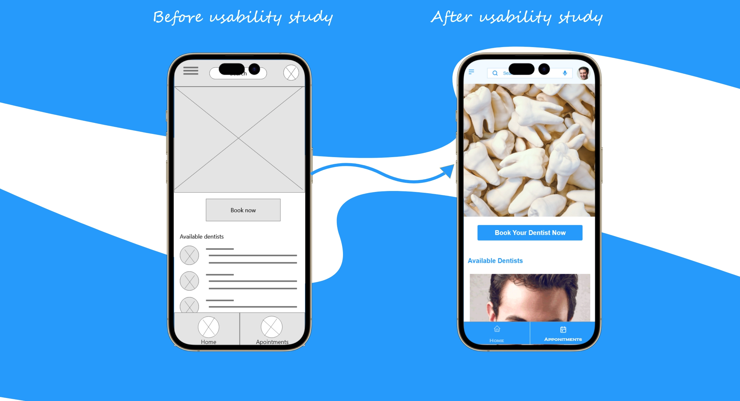
Based on the insights from the usability studies, I applied design changes like providing a clear section to browse only available appointments for each dentist.
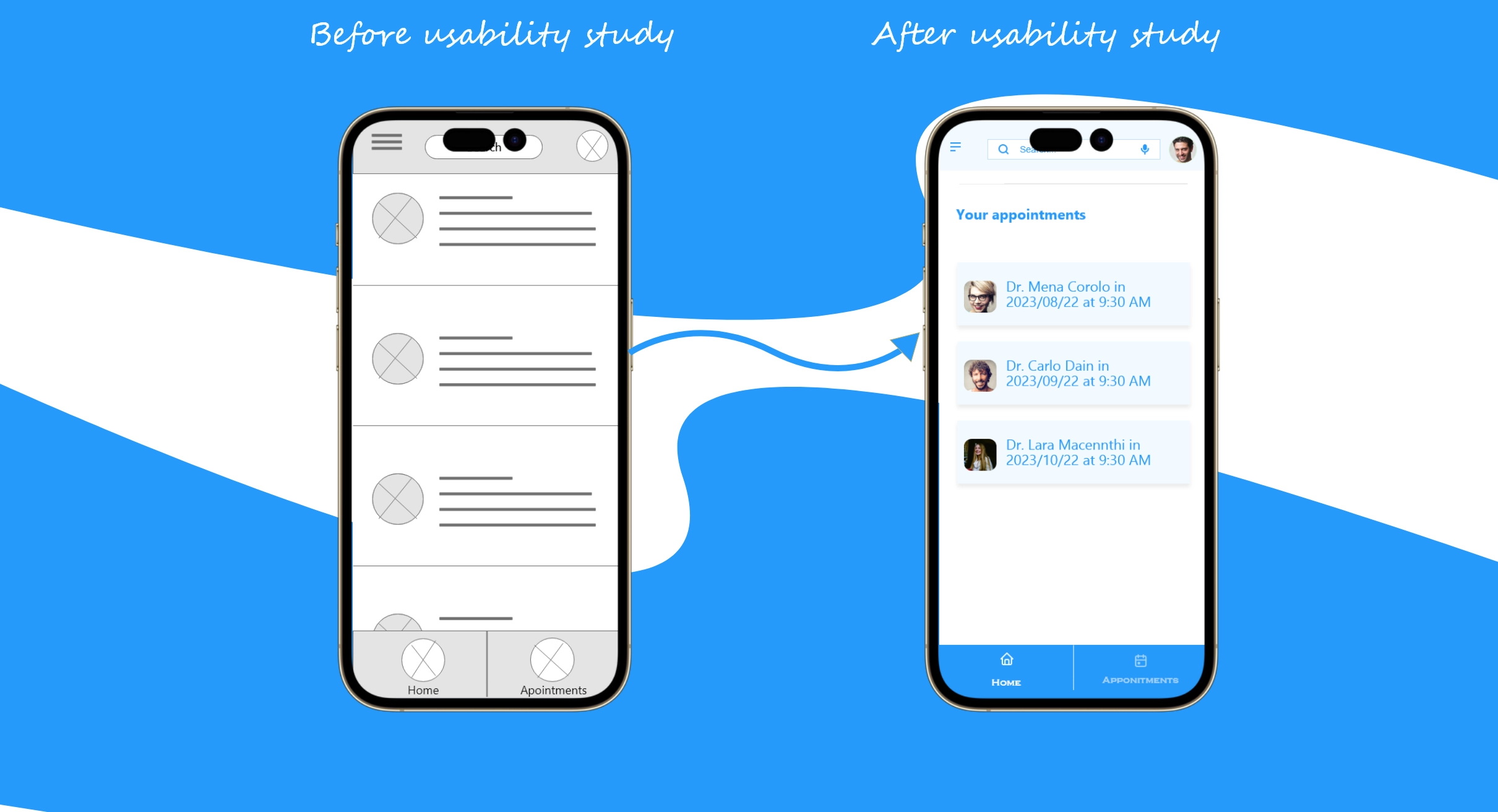
Additional design changes included adding icons to the navigation bar and providing a clearer indication of how to navigate through the app.
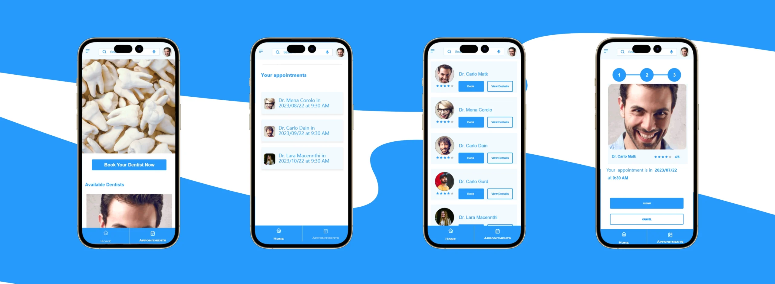
High-fidelity prototype
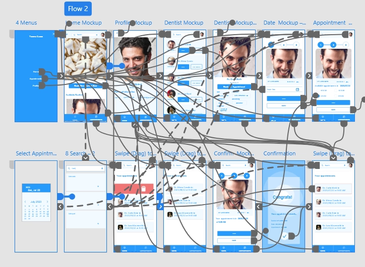
The high-fidelity prototype followed the same user flow as the low-fidelity prototype, including design changes made after the usability study.
Accessibility considerations
Clear labels for interactive elements that can be read by screen readers.
The initial focus of the home screen on personalized recommendations helps define the dentist or appointment for the user.
Responsive Design
- Information architecture
- Responsive design
Sitemap

With the app designs completed, I started work on designing the responsive website. I used the Tooth Care sitemap to guide the organizational structure of each screen’s design to ensure a cohesive and consistent experience across devices.
Responsive designs
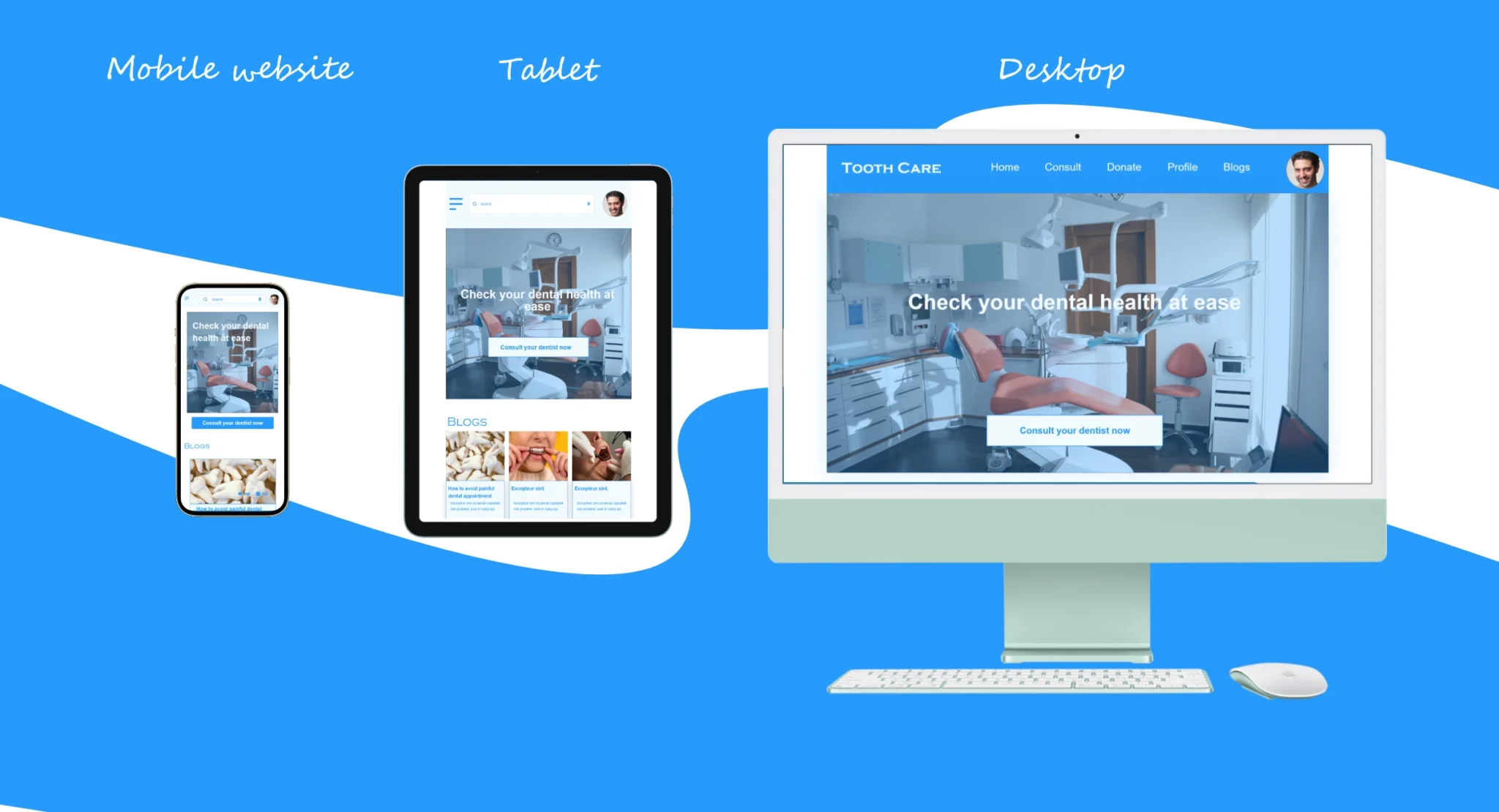
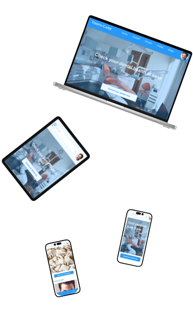
The designs for screen size variation included mobile, tablet, and desktop. I optimized the designs to fit the specific user needs of each device and screen size.
Going forward
- Takeaways
- Next steps
Takeaways
Impact:
Users shared that the app made dental health seem like something they could actually help improve. One quote from peer feedback was that “the Tooth Care platform helps bring caring about the dental health to a personal level in a way that’s easy and engaging.”
What I learned:
I learned that even though the problem I was trying to solve was a big one, diligently going through each step of the design process and aligning with specific user needs helped me come up with solutions that were both feasible and useful.
Next steps
Conduct research on how successful the app is in reaching the goal to improve dental health.
Add more educational resources for users to learn about dental health
Provide incentives and rewards to users for successfully improving their dental health.
Thank you for your time reviewing my work on the scala's sales management app! If you’d like to see more or get in touch, my contact information is provided below.
